Introduction
Ever looked at a presentation and instantly felt calm, excited, or even a little bored? That might be because of the colors used in the slides. Color is not just decoration—it tells a story, sets the mood, and speaks to your audience in ways that words can’t. When it comes to pitch decks, choosing the right color palette can make a big difference in how investors feel about your startup.
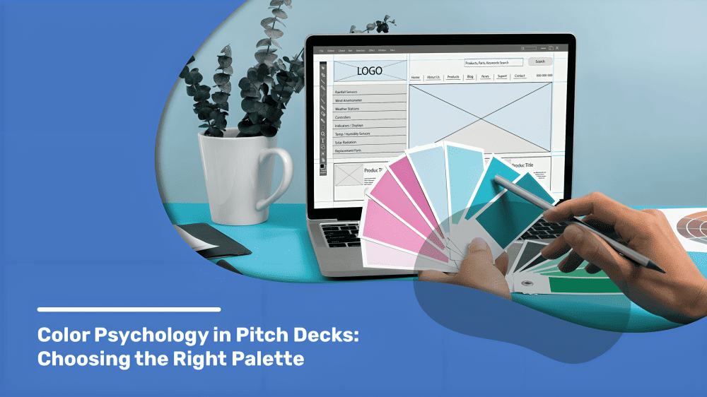
In this blog, we’ll explore how color psychology works, what different colors mean, and how you can use this knowledge to design pitch decks that impress and connect.
Why Does Color Matter in Pitch Decks?
Colors create emotional responses. They can make your audience feel trust, urgency, excitement, or confidence—all within a few seconds. In a pitch, where every second counts, colors can either work for you or against you.
What color can do in a pitch deck:
- Build trust with your brand: Using consistent brand colors builds recognition and makes your company feel reliable.
- Guide the viewer’s attention to key points: Bright or contrasting colors can highlight important numbers or messages.
- Evoke emotions like excitement or calm: A red slide might energize the room, while a soft blue might make people feel more secure.
- Support your story without saying a word: If you’re telling a story about innovation, bold colors like purple or green can silently strengthen that message.
Understanding Color Psychology: What Each Color Says
Here’s a simple breakdown of common colors and what they usually represent:
Blue
- Trust, stability, professionalism
- Often used by banks, tech firms, and SaaS startups because it makes people feel secure and confident.
Red
- Energy, urgency, passion
- Ideal for drawing attention to metrics, deadlines, or competitive advantages. Too much can be overwhelming, so balance it well.
Green
- Growth, health, money
- Common for eco-focused companies, finance startups, or wellness products. Green feels fresh and full of potential.
Yellow
- Optimism, creativity, attention
- Best used in small doses to highlight ideas or headlines. Too much can tire the eyes.
Orange
- Friendliness, enthusiasm
- Gives off a warm, approachable vibe. Works well in customer-focused, service-oriented decks.
Purple
- Imagination, luxury, wisdom
- Used by fashion, beauty, or innovation-led startups. It suggests high-end thinking and creativity.
Black/Gray
- Sophistication, seriousness
- Clean, strong, and modern. Use for premium offerings or B2B decks.
White
- Clarity, simplicity, freshness
- Provides breathing room in design and improves readability. Great as a background base for contrast.
How to Choose the Right Color Palette for Your Deck
Choosing the right colors means aligning them with your message, brand, and audience. Here are steps to help you get started:
1. Know Your Brand Personality
Is your startup fun and bold or serious and professional? Fun brands might lean towards orange, pink, or yellow. More corporate startups often stick with blues and grays.
2. Think About Your Audience
Investors in fashion may expect something trendy or expressive. Fintech investors may want something sleek and reliable. Your colors should match what your audience expects and respects.
3. Use Contrast Wisely
Good contrast makes slides easier to read. For example, white text on a dark background can be striking, while black on white is clean and readable. Low contrast makes important points easy to miss.
4. Stick to 2–3 Core Colors
More colors can confuse or distract. Try one primary color (like blue), one secondary (like orange for highlights), and a neutral (like gray or white).
5. Test It Out
Before finalizing, show your deck to a few people and ask how they feel about it. If it feels too loud or too dull, tweak it. Feedback reveals how your colors are truly working.
Seeing real-world use of color makes it easier to understand what works and what doesn’t. Many successful startups choose colors that reflect their mission and connect with their audience.
How Deckez Can Help
Not sure which colors to choose? Our expert presentation designers understand color psychology and help to make your startup shine. We help you create pitch decks that not only look good but also feel right to investors.
We study your brand, your audience, and your goals to build a palette that supports your pitch. Whether you’re preparing for a big investor meeting or building a general company deck, our professional pitch deck designers make sure the colors work for your message.
Want your deck to leave a lasting impression? Let us do the design work while you focus on your story.
Final Thought
Color isn’t just about style—it’s about substance. The right palette can lift your message and make your pitch memorable. So before you finalize your deck, ask yourself: what do your colors say about your startup?
A deck with thoughtful color choices looks more professional, connects faster, and builds trust more easily. In the world of pitching, every detail counts. Color is one of the easiest ways to gain an emotional edge.
FAQs
1. Can I use bold colors like red or neon green in my pitch deck?
Yes, but use them carefully. Bold colors work great for spotlighting important points but can be too intense if used too much.
2. Should I match my pitch deck colors to my brand colors?
Absolutely. Using your brand colors makes your deck look unified and helps people remember your company better.
3. Are dark-themed pitch decks effective?
Yes, dark backgrounds look sleek and modern, especially for luxury or tech brands. Just make sure the text is readable.
4. How many colors should I use in a pitch deck?
Stick to 2–3 main colors and one neutral background tone. This keeps the deck clean and focused.
5. What if I’m colorblind or unsure about design?
Use free tools like color contrast checkers. Or let a professional design team like Deckez create the perfect color story for your brand.