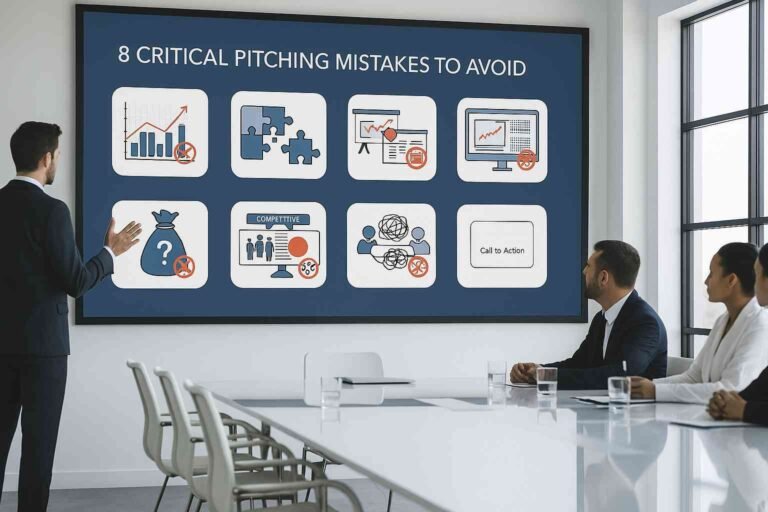
You’ve practiced your pitch a hundred times. Your business model is solid. Your numbers look great on paper.
But when you open your pitch deck, the slides look… off. Cluttered. Confusing. Not the kind of deck that wins investor confidence.
Here’s what most founders don’t realize: investors make decisions with their eyes first, their brains second. A messy deck suggests a messy business. A clear deck suggests a founder who gets it.
The good news? You don’t need design skills to fix this. You just need to understand what makes visuals work in a pitch deck context.
This guide provides practical, no-fluff tips you can use today to create pitch deck visuals that support your story and secure funding.
Why Visuals Are the Foundation of Investor Confidence
Let’s talk about reality for a second. When an investor opens your deck, they’re not reading every word—they’re scanning. Their eyes jump from number to number, looking for reasons to keep reading or reasons to stop.
The Science Behind Visual Processing
Your brain processes images 60,000 times faster than text. That’s not a typo. When information has strong visuals, people remember 65% of it three days later. Without visuals? They remember just 10%.
For a pitch deck, this matters enormously. You’re asking someone to remember your business, believe in your vision, and write a check. Visual clarity isn’t optional; it’s the core of memory retention.
Time Is Your Enemy
Most investors spend three to four minutes on a first look at your deck. Your visuals need to do heavy lifting in that short time: they must communicate fast, stick in memory, and make your key points obvious at a glance. For more detailed guidance on how to structure this limited time, read our complete guide on the must-have slides and tools in every investor pitch deck.
Part 1: Start with Clarity, Not Creativity
Everyone wants their pitch deck to look amazing. But you know what’s better than amazing? Clear. When investors understand your slide in three seconds, you win.

1. The One-Slide, One-Point Rule (The Golden Rule)
This is the single most important principle. Every slide must communicate exactly one thing.
- Market size slide shows market size.
- Traction slide shows traction.
- Team slide shows your team.
Don’t try to show revenue growth, user metrics, and market opportunity on the same slide. Pick one central idea. Give it space. Make it clear.
2. Why Empty Space Isn’t Wasted Space
New founders think empty space is wasted space. They are wrong.
White space (or “breathing room”) creates focus. It lets your important information breathe and gives the eye a place to rest. This space is what makes the difference between a deck that looks rushed and one that signals quality and confidence. Think of a luxury brand; their packaging uses tons of empty space—it’s intentional.
Part 2: Build a Color and Typography Strategy
Colors and fonts do more than make your deck pretty; they guide attention and communicate professionalism.
3. The Three-Color Maximum
Chaos happens when you use too many colors. Use this formula and stick with it:
- Color One (Primary): Your brand color, appearing on every slide.
- Color Two (Accent): A contrasting color for highlighting crucial data or a call-to-action.
- Color Three (Neutral): Gray, dark blue, or black for backgrounds and body text.
Psychology Check: Blue conveys trust (good for finance). Green suggests growth (good for performance). Match your palette to your company’s core message.
4. Typography: Two Fonts, No More
Fonts are not a minor detail. The wrong choices ruin credibility.
- Font Choice: Use Sans-serif fonts (like Montserrat, Lato, or Roboto). They are clean, modern, and highly readable on screens and projectors. Avoid script, decorative, or highly stylized fonts.
- Sizing for the Room: Pretend your deck is viewed from 15 feet away. Your minimum body text must be 18–20 points. Slide titles should be 36–44 points. If you need smaller text, you have too much text.
Consistency is everything. Use the exact same font, size, and weight for similar elements across all slides (e.g., all section headings must match). Random changes signal amateurism.
Part 3: Master Data Visualization and Hierarchy
This is where most pitch decks fail. Great numbers are ruined by confusing charts.

5. Match Your Chart to Your Message
Every data visualization type has a specific job. Using the wrong one makes data harder to understand.
| Goal | Best Chart Type | Why it Works |
| Comparing Categories | Bar Charts | Visually compares different segments or groups (e.g., Q1 vs. Q2 revenue). |
| Showing Trends Over Time | Line Charts | Our brains naturally see the slope as growth or decline (e.g., user growth, ARR over 12 months). |
| Showing Simple Proportions | Pie Charts | Use only for 3–5 pieces maximum to show simple parts of a whole. |
| Showing Single Key Metric | Just a Big Number | $5M ARR in huge type beats a fancy chart any day. |
What Not to Do: Forget 3D charts. Don’t use default Excel styling. Round your numbers ($1.8M is clearer than $1,847,392.47).
6. Create Visual Hierarchy to Draw Attention
When everything on your slide has the same visual weight, nothing stands out. Hierarchy guides your viewer’s attention.
- Size Creates Importance: The biggest element on your slide gets noticed first. Make your key metric (e.g., “300% Growth”) the largest element.
- Color Draws the Eye: Use your single accent color to highlight the most important data point. If your slide is mostly blue and gray, an orange number jumps off the page.
- Tell People What to See: Label everything clearly. Add a clear, brief takeaway sentence at the top of the chart so investors don’t have to work to find the insight. This is critical for communicating key metrics. To understand exactly which financial metrics you should be tracking and highlighting, check out our deep dive into investor-ready key performance indicators.
Part 4: Use Images and Icons with Purpose
Images elevate your deck, but only if they are used correctly.

7. Every Visual Needs a Job
Don’t add images just to fill space. Every image, screenshot, or graphic must serve a specific purpose:
- A product screenshot shows what you’ve built.
- A team photo builds trust.
- A diagram explains a complex process.
Quality is Non-Negotiable: Use high-resolution images only. If an image is pixelated, it instantly destroys your credibility. Use the best photo sites for high-quality visuals, but avoid cliché images.
Icon Consistency: If you use icons, pick one style (flat, line, or filled) and use only that style throughout your entire pitch deck.
Your Pre-Pitch Visual Checklist
Before you send your deck, run through this final list.
| Checklist Category | Key Questions |
| Clarity Test | Can I understand the main point of this slide in three seconds? Does it communicate one idea? |
| Consistency Check | Are my fonts and colors identical throughout the whole deck? |
| Readability Standard | Is the smallest text readable from ten feet away? Is the text contrast high? |
| Data Review | Am I using the right chart type for the story? Is the most important number highlighted? |
| Professional Polish | Are all images high-res? Have I removed all the 3D charts and silly animation effects? |
Time to Build Your Investor-Ready Deck
Creating powerful visuals for your pitch deck isn’t about being a design genius. It’s about being clear, intentional, and consistent.
Remember the core principles: keep it simple, create visual hierarchy, use colors strategically, and maintain consistency. Don’t let weak visuals undermine all the hard work you’ve put into your business idea and your numbers.
For more strategic guidance on pitching beyond the slides, we recommend exploring the definitive Top 25 Best Pitch Deck Examples. These examples reinforce the core narrative principles that visuals must support, showing you how successful founders apply visual clarity to real-world data.
Now go create a deck that looks as confident as you feel about securing your funding.
Frequently Asked Questions
What makes a pitch deck visually appealing?
A visually appealing pitch deck is clean, focused, and consistent. It uses plenty of white space, maintains the same color scheme and fonts, and presents information in the simplest way possible. The best decks impress by making complex ideas instantly clear.
How many slides should a pitch deck have?
Most successful pitch decks have 10–15 slides. This covers all essential points without testing attention spans. Remember, investors want to spend more time talking about your business than reading your slides.
Do I need a designer for my pitch deck?
Not necessarily. If you follow clear design principles, you can create a professional deck yourself. However, if you’re short on time or design isn’t your strength, professional services can transform your content into an investor-ready deck while you focus on perfecting your pitch.
What’s the biggest visual mistake in pitch decks?
The biggest mistake is information overload. Founders try to cram multiple charts, paragraphs of text, and several images onto single slides. This creates visual chaos and makes it impossible for investors to identify what matters. The fix is simple: one slide, one message, lots of empty space.


