
Introduction
Choosing the best background for your presentation is one of the easiest ways to make your slides look clean, readable, and professional. Many of us just imagine that slide backgrounds are decorative elements. But the truth is that they actually add a special design to your presentation. It not only enhances your presentation’s look but also affects how your audience feels and understands your message.
Do you know that a soft, well-chosen background makes your presentation slide feel calm? Yes, it works — just try it in your next presentation. A busy or loud background can instantly confuse the viewer. In the world of presentations—whether it’s Google Slides, PowerPoint, or any digital deck—the presentation background plays a huge role in capturing attention.
At present, people search for different types of PowerPoint background designs like clean backgrounds, image backgrounds, gradient backgrounds, and even textured layouts. The reason is they want slides to look modern and easy on the eyes.
In this guide, we will explore how to choose the perfect background, what types work best, and what mistakes to avoid. So even a beginner can make beautiful slides without design skills.
1. Why Your Presentation Background Matters More Than You Think
Do you know one thing before anyone reads your text, their eyes notice your slide’s overall feel? Yes, the research has proved that if 90% of your presentation holds a good looking feel then it’s success rate is 100%. Colors, textures, spacing, and tone create an instant impression. For example, just like the look of a room or place which feels pleasant can influence your mood before you sit down.
On the other hand, a messy or bright background can make your information feel unprofessional even if your idea is brilliant. Have you noticed a clean and calm slide background builds trust and keeps the viewer focused, and creates a sense of balance.
This is exactly why presentation designers focus so much attention to PPT background design. The background sharply guides the audience’s eyes and helps them understand what is important.
A good background does not seek fake attention. It supports your message quietly in the background.
2. Simple Rules to Select the Right Background

Selecting the best presentation background becomes very simple when you follow a few simple tips and tricks:
Go for Strong Contrast
Your text should always stand out clearly.
- Dark background → light text
- Light background → dark text
This improves readability instantly.
Avoid Busy or Loud Patterns
Detailed textures, heavy patterns, or bright colors can distract your audience. If your background pulls attention away, it’s not the right choice.
Match the Background to Your Topic
A pitch deck needs a different background than a school project. The background should reflect the mood of your message.
Keep the Style Consistent Across Slides
Changing backgrounds too often makes your presentation feel unplanned. One theme creates a professional look.
For more clarity tips, you can also read our Presentations on branding — it explains how visuals build trust and improve storytelling.
3. Types of Presentation Backgrounds
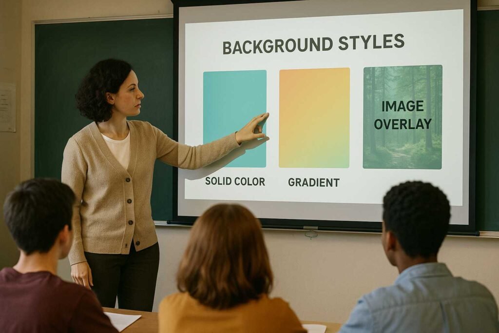
A. Solid Color Backgrounds
Do you know solid colors are the safest and best choice? Yes, they create a strong, simple foundation for your content.
Common solid backgrounds include:
- White
- Light grey
- Beige
- Navy
- Charcoal grey
These colors look professional on any screen. They play an important role in reducing distraction, making them ideal for business reports, sales decks, or academic presentations.
If you choose neon shades or very bright colors—they might strain the eyes and make your presentation feel unprofessional. So, choose color shades that add a good feel to your presentation.
B. Gradient Backgrounds
A gradient background theme works on blending two colors softly. It feels modern, smooth, and visually appealing without being distracting.
Popular gradients include:
- Blue → Sky blue
- Purple → Lavender
- Grey → White
- Teal → Aqua
Gradients work beautifully for:
- Startup presentations
- Tech conferences
- Creative or product demos
Just keep the gradient gentle. Strong or high-contrast gradients can overpower your text. For more color tips, you can also check our guide on Color Psychology.
C. Image Backgrounds
Using background images can look stunning when done right. Images add emotion, create context, and make a slide instantly engaging.
But they must be used carefully.
Choose images that:
- Have empty space for text
- Are soft in color
- Don’t have too many objects
- Don’t clash with your content
You can also go for a transparent overlay to make the image look subtle and help the text stand out.
For slide design mistakes to avoid, you can also check this helpful guide: top 10 design mistakes. Image backgrounds are best for title slides or section dividers—not for every slide.
D. Textured and Pattern Backgrounds
Textures such as light paper grain, soft lines, soft dots, or gentle geometric shapes can add depth to your slides. They give a smooth visual feel without distracting from your message.
However, avoid bold or repetitive patterns because they pull focus away from your content. Your texture should be subtle enough that the text still feels easy to read.
Textures work especially well for:
- Creative portfolios
- Workshops
- Educational sessions
- Light storytelling presentations
4. Match Your Background to Your Topic and Audience

A strong presentation always feels intentional. Your background should match your subject, your industry, and the mood of your message.
Corporate or Business Presentations
Use clean colors like navy, grey, or white. They feel trustworthy and serious.
Education or Training
Soft greens, blue and pastel shades make slides feel friendly and calming.
Technology or Startup Pitches
Dark themes, minimal gradients, and bold accents make your slides look modern.
Creative or Design Projects
You can use artistic backgrounds, textures, or simple abstract patterns.
Your background should make the audience feel,
“This presentation fits the topic.”
5. Common Background Mistakes to Avoid
Even experienced presenters fall into these traps:
Using very busy images
This hides your text and reduces clarity.
Strong or neon colors
They look unprofessional and hurt readability.
Too many background changes
Inconsistency makes your deck look messy.
Low text contrast
If people can’t read your text easily, your message loses meaning.
Patterns that overpower content
Patterns should support, not dominate.
Simple backgrounds are almost always better than creative but chaotic ones.
6. Deckez Tips for Choosing the Perfect Presentation Background
At Deckez, we design hundreds of presentations for founders, creators, and business teams. Here are our go-to rules:
Write your content first
Your background should support the ideas—not the other way around.
Leave breathing space
White space makes slides look premium and comfortable.
Keep backgrounds consistent
This gives your deck a clean, unified look.
Test on different screens
What looks bright on a laptop may look dull on a projector.
Use color psychology
Every color creates a mood.
Blue feels safe, green feels fresh, white feels clean.
These simple principles make a big difference in how your message is received.
Conclusion
Choosing the right background for your presentation isn’t about design tricks—it’s about clarity, readability, and creating the right atmosphere. When your background supports your content instead of distracting from it, your slides become easier to understand and far more professional.
And if you ever need slides that look clean, modern, and polished, Deckez can help design the perfect presentation. You focus on your message. We shape the slides that carry it.
The right background doesn’t just decorate your slides—
it makes your message unforgettable.
FAQ SECTION
1. What is the best background for a presentation?
The best background is one that keeps your text readable and your slide clear. Solid colors and soft gradients are the safest choices. They reduce distractions and keep the audience focused.
2. Are image backgrounds good for presentations?
Yes, if used carefully. Choose images with enough empty space and soft tones. Add an overlay to make the text pop.
3. What colors work best for business or corporate slides?
Navy blue, light grey, white, and charcoal are the most professional colors. They give a clean and trustworthy look.
4. Should every slide have a different background?
No. Using too many background styles breaks consistency. Stick to one background theme to make your deck look polished.
5. What background works best for creative presentations?
Subtle textures, simple abstract shapes, or soft artistic backgrounds work well. Just make sure they don’t overpower your content.