
What makes your presentation easy to understand and engaging? A bar chart in Google Slides is one of the easiest choices to show comparisons in a presentation. It helps the audience understand your message in seconds. Whether you want to explain sales numbers, student marks, survey results, or how your performance changed month by month, a bar chart turns plain numbers into a clear visual.
And to your surprise, Google Slides makes the bar chart creation process very simple. It works together with Google Sheets too. Once you learn the basic steps, you can start creating any type of bar graph in Google Slides without needing design skills or advanced tools.
In this guide, you’ll learn:
- How to create a bar chart in Google Slides
- How to edit your numbers
- How to change the look of your chart
- How to make everything match your slide theme
Every step is explained in very easy steps, so even beginners can follow it without confusion.
What You’ll Learn
- How to insert a bar chart in Google Slides
- How to edit bar graph data using Google Sheets
- How to format, resize, and customize your bar chart
- How to update values quickly
- FAQs for common user questions
1. How to Make a Bar Chart in Google Slides (Step-by-Step)
It only takes a few seconds to create a bar chart in Google Slides, but understanding how it works will help you create charts that are more accurate and clean.
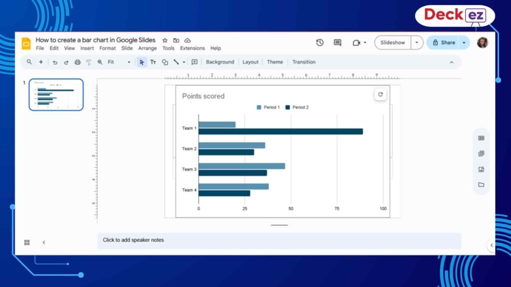
Step 1: Insert the Bar Chart
First, open your Google Slides presentation and choose the slide where you want the chart to appear.
Next, follow these steps:
- Go to the top menu
- Click Insert
- Click Chart
- Choose Bar
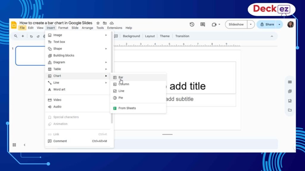
Google Slides will place a sample bar chart on your slide. This sample chart uses random numbers just to show the structure. It is linked to Google Sheets, which holds the actual data behind the chart.
This link is very useful because you can change the data anytime, and your chart will update automatically.
Why This Step Matters
The chart you see now is just a starting point. Think of it like a small template. You will soon replace the sample numbers with your real information and change the design to fit your needs. A good starting chart makes the rest of the steps much easier.
2. Edit Your Bar Chart Data Using Google Sheets
When you click on the bar chart in Google Slides, you’ll see three small dots in the corner. These dots let you open the data sheet quickly.
How to Open the Data Sheet
- Click the chart
- Click the ⋮ (three dots)
- Select Open Source
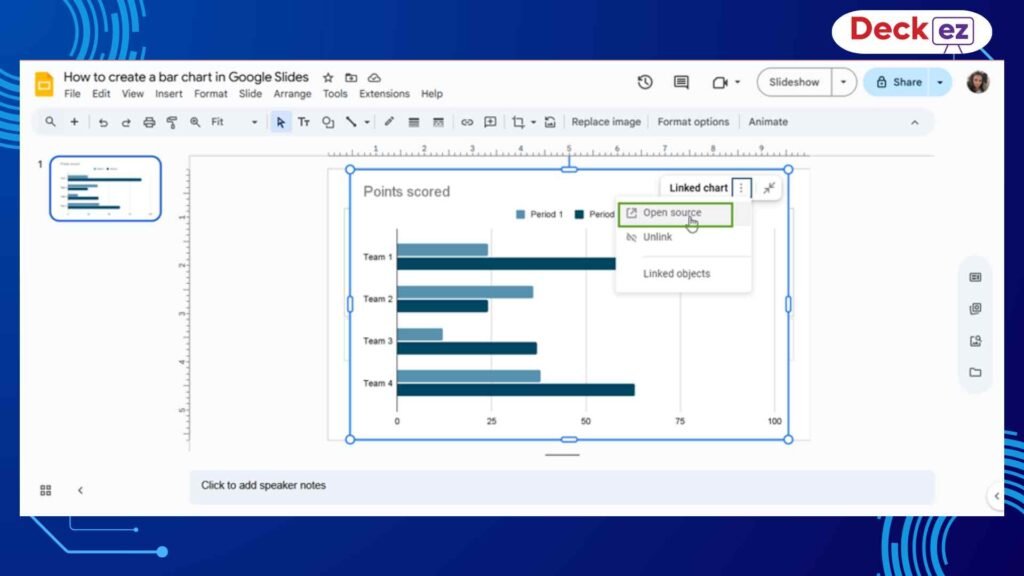
This will open a Google Sheets bar chart data file with sample categories and values.
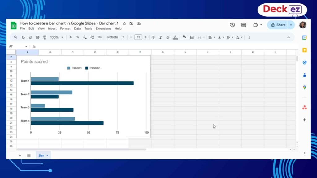
How to Add Your Own Data
Inside the sheet:
- Replace the sample labels in Column A with your own categories
- Replace the numbers in the next columns with your real values
- Add more columns if you have multiple sets of data
- Add more rows if you have more items to show
After updating the number
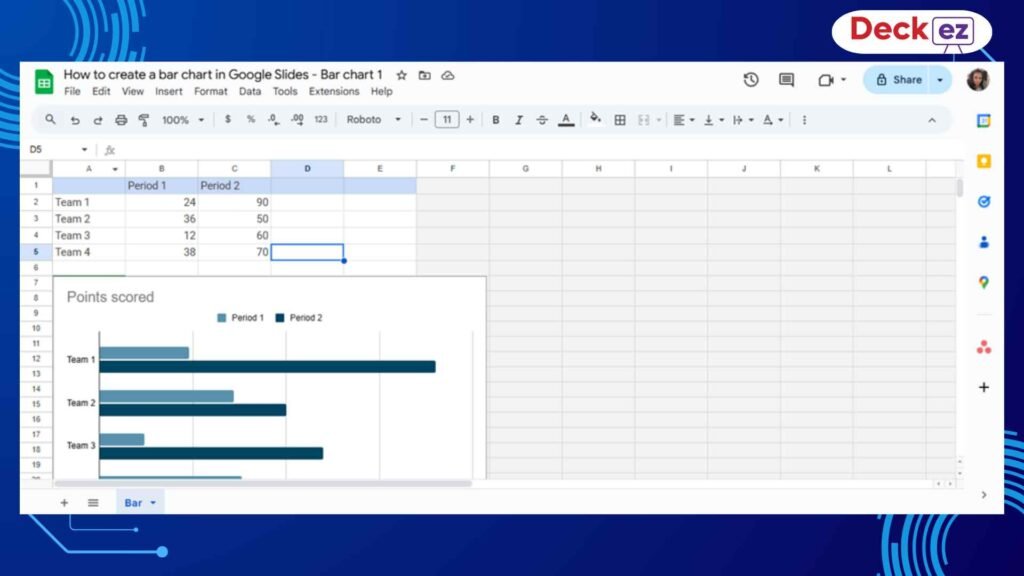
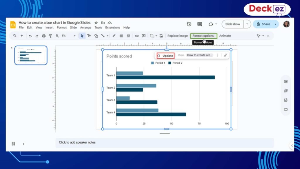
After updating everything, return to Google Slides.
Refresh the Bar Chart
You will see an Update button above your chart.
Just click it, and your bar chart will refresh instantly.
Why Editing in Sheets Matters
Google Sheets makes it easy to handle many numbers, fix mistakes, add new items, and keep everything accurate. It keeps your bar chart in Google Slides clean and professional.
3. Edit Your Bar Chart (Colors, Labels, Titles & Style)
After entering your data, it’s time to bring your Google Slides bar chart to life. With Google Sheets’ Chart Editor, you can easily customize colors, labels, titles, and the overall style.
How to Open the Chart Editor
- Go to Google Sheets
- Click the chart
- Click the three dots
- Select Edit Chart
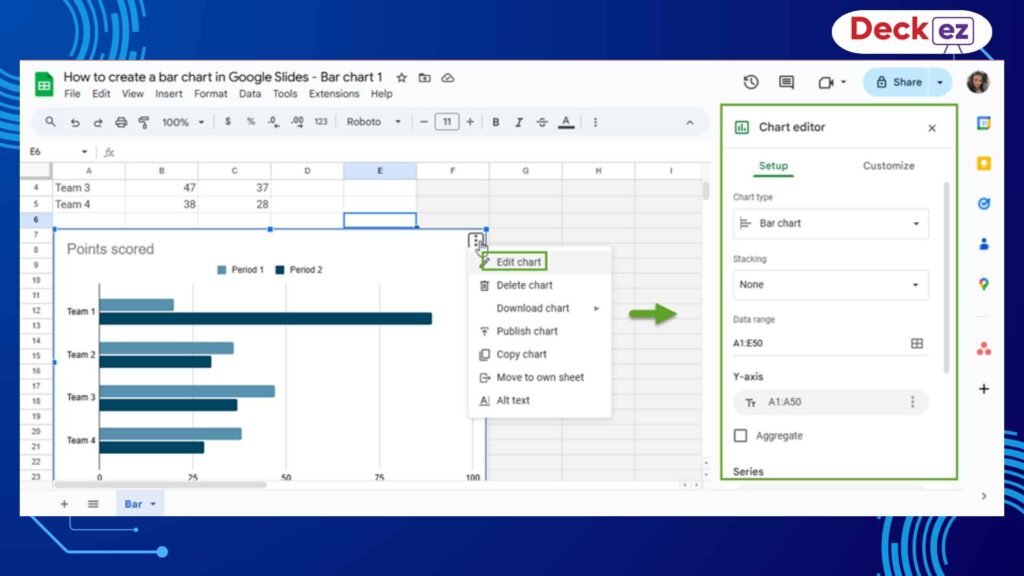
You’ll see two main tabs:
- Setup – for selecting data
- Customize – for editing design
A. Add Chart Titles and Axis Titles
A clear title tells your audience what the data is about.
To edit titles:
- Go to Customize
- Click Chart & Axis Titles
- Choose what you want to edit:
- Chart Title
- Horizontal Axis
- Vertical Axis
- Chart Title
- Change the text, font size, color, and style
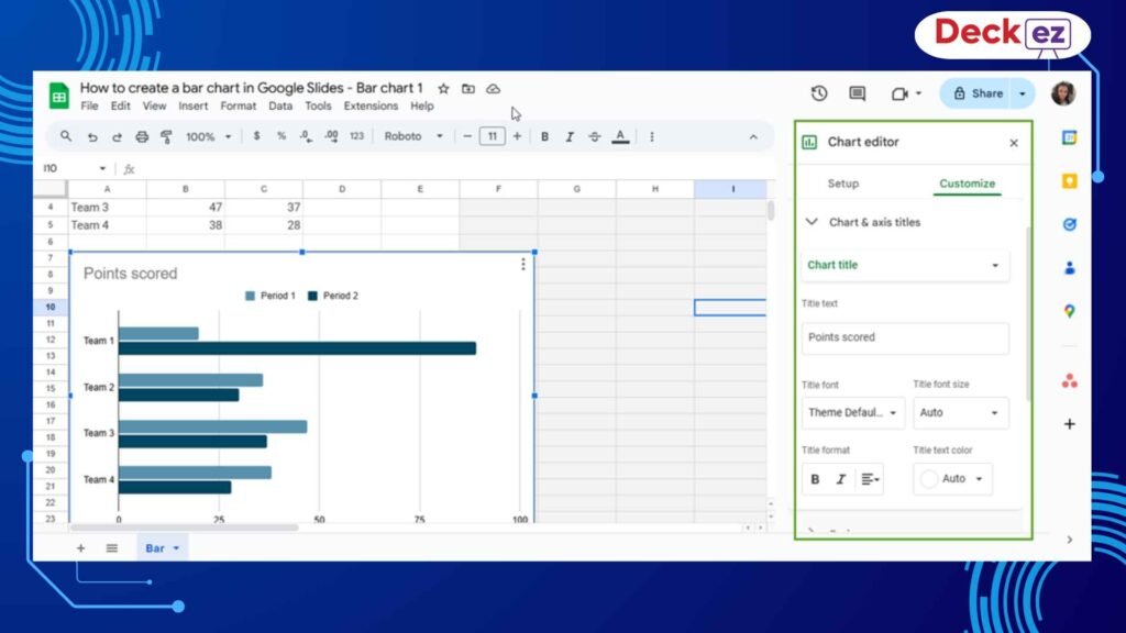
Why Titles Matter
A chart without a title can confuse people. A simple title helps the audience understand the message with just one look.
This improves the clarity of your Google Slides bar graph.
B. Add Data Labels (Numbers on Bars)
Data labels show the value on each bar. This makes the chart easier to read and removes guesswork.
To add labels:
- Go to Customize
- Click Series
- Check Data labels
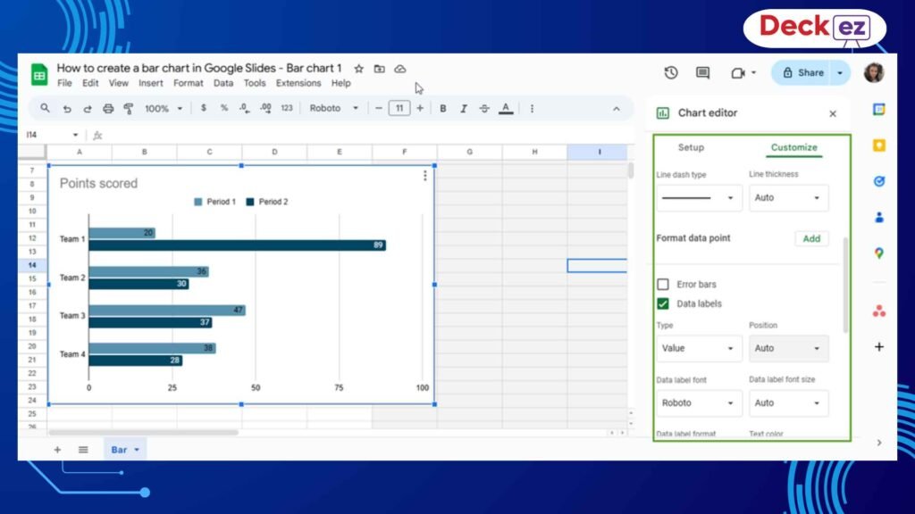
Why Data Labels Matter
Your audience should not have to guess the value of each bar. Labels make the chart clear and accurate.
C. Customize Colors for Better Clarity
Changing colors makes your chart more attractive and helps people compare values easily.
To change colors:
- Go to Customize
- Open Series
- Select a color from the palette
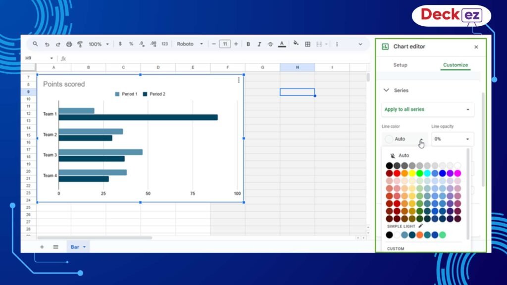
Tips & Tricks for Choosing Colors
- Use simple, clean colors
- Avoid too-dark or neon shades
- Use your company’s brand colors if needed
- Use different colors if each bar represents something unique
Color helps your chart stand out and keeps your audience focused on the message.
D. Adjust Chart Style
In Customize → Chart Style, you can:
- Add a background color
- Add borders
- Make a 3D bar chart
- Adjust bar spacing
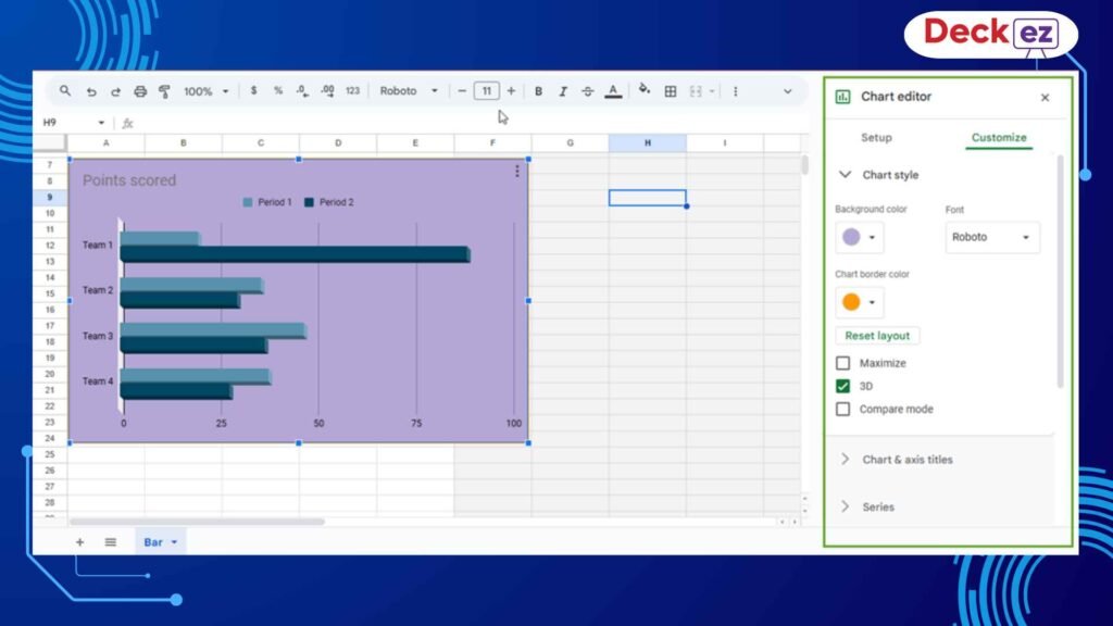
These options help your bar chart in Google Slides match your theme.
4. Format Your Bar Chart in Google Slides (Optional)
After customizing the chart in Sheets, you can fine-tune its look directly on the Google slide by clicking the update option on the sheet.
How to Open Format Options
- Click the chart in Google Slides
- Click Format Options
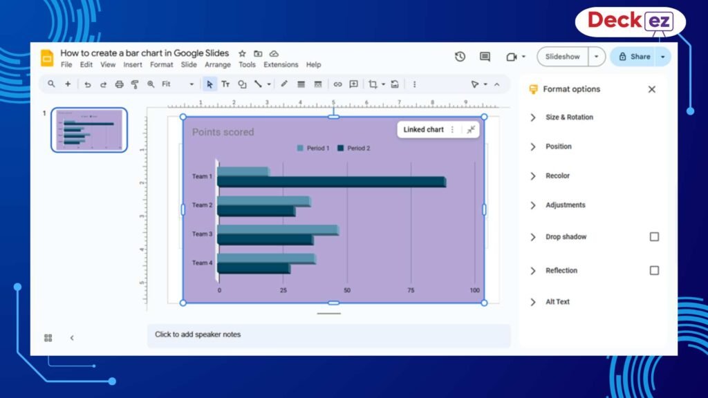
Here, you can adjust:
- Size
- Position
- Shadows
- Reflection
- Rotation
This helps your Google Slides bar chart fit perfectly on the slide. If you want to learn about adding hyperlinks in Google slides, then check this guide.
5. Example: When a Bar Chart Makes Your Presentation Stronger
Imagine you are presenting monthly performance data. A bar chart allows your audience to instantly understand:
- Which product performed best
- Which product needs improvement
- How results compare
- How performance changed over time
A Google Slides bar graph communicates faster than text or tables. Bar charts are helpful for business presentations, group presentations, investor pitch deck presentations, business meetings, and so on. If you want to learn about how to use years in a bar chart in Google Slides then check out this guide.
Final Thoughts
Now, from the above guide, you might have a clear idea about how to make a bar chart in Google Slides—from inserting the chart to editing data and customizing the design.
A clean bar graph helps your message stand out and look more appealing.
If you want your presentation slides to look even more professional, consider using a presentation design service that can create polished, visually appealing slides for you.
Frequently Asked Questions
1. How do I create a bar chart in Google Slides?
Go to Insert → Chart → Bar, then update your data in Google Sheets.
2. Can I add more data series?
Yes. In Google Sheets, go to Edit Chart → Setup → Add Series → Select Data Range.
3. How do I change bar colors?
Go to Customize → Series inside the Chart Editor.
4. Can I insert a bar chart directly from Google Sheets?
Yes. Go to Insert → Chart → From Sheets and choose your sheet.
5. Why does my chart not update?
Click the Update button on your chart in Google Slides.