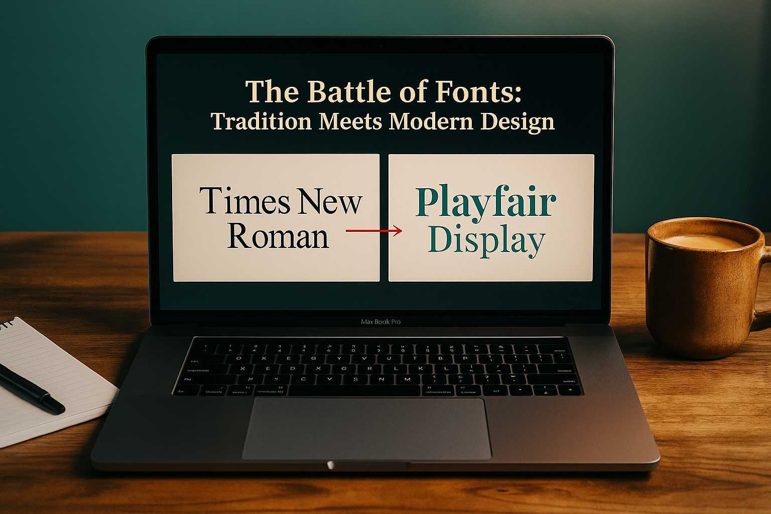
The Battle of Fonts: Tradition Meets Modern Design
If you’ve ever opened PowerPoint, Word, or Google Slides, you’ve met the world’s most famous typeface — Times New Roman. For years, it was the quiet workhorse behind essays, reports, and business slides. Reliable. Familiar. Predictable.
But design tastes have changed. The fonts we choose now say as much about us as the words we type. Enter the modern serif fonts — elegant, screen-friendly, and full of personality. They carry the same classic roots as Times New Roman but with smoother shapes, lighter spacing, and a more modern feel.
So which one should you use for your next presentation — the timeless classic or its modern, digital-age cousin? Let’s dive in.
A Quick Look Back at Times New Roman
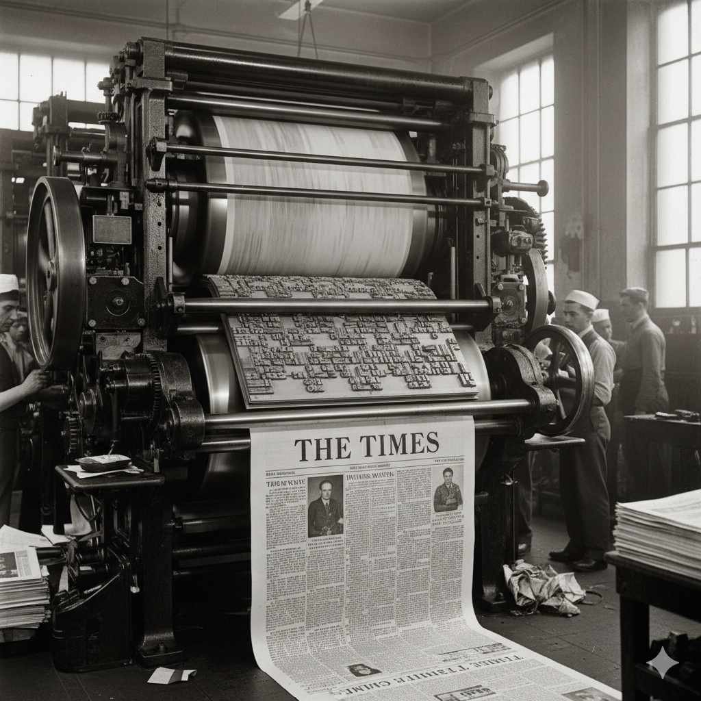
Times New Roman wasn’t created for slides or screens — it was born for newspapers. Designed in the 1930s for The Times of London, it was built to fit lots of text neatly into narrow columns without losing legibility. Back then, it was a design breakthrough.
When Microsoft adopted it in the early 1990s, Times New Roman became the global default. Students used it for essays, offices for reports, and writers for manuscripts. It was everywhere — and that’s both its charm and its curse.
It’s familiar, yes. But it’s also overused. On presentation slides, it can come off as a little too formal or even dull. The world has moved on to screens, and Times New Roman still looks like it’s printed on paper.
The Rise of Modern Serif Fonts
Modern serif fonts were created to solve the problems Times New Roman couldn’t. They preserve the graceful serif details at the edges of letters — those little strokes that give text character — but they rework them for the digital era.
Think of fonts like Lora, Playfair Display, Merriweather, or Libre Baskerville. They feel balanced, elegant, and screen-ready. They have softer curves, slightly wider spacing, and clean edges that look great whether you’re presenting on a 13-inch laptop or a 100-inch projector.
In short, modern serif fonts give you that “professional but creative” look — something Times New Roman has trouble achieving. They don’t just carry your message; they elevate it.
Why Modern Serif Fonts Work Better for Presentations
Fonts do more than fill space. They define the voice of your slides. They tell your audience whether your presentation feels formal, warm, or creative. And when it comes to readability, modern serif fonts often win hands down.
Here’s why they make a difference.
1. They’re Built for Screens
Times New Roman was optimized for printing ink on paper. Its narrow letters and tight spacing can look harsh on bright digital displays. Modern serif fonts, by contrast, are designed with pixels in mind. Their smooth edges, generous spacing, and balanced proportions make them easy to read even from the back of the room.
2. They Feel Fresh
Your audience has seen Times New Roman thousands of times. Using a newer serif font instantly refreshes the tone of your slides. It’s a subtle but powerful change that tells your audience you care about design. Fonts like Playfair Display or Lora add a sense of sophistication without looking stiff.
3. They Add Personality
Times New Roman says “formal and serious.”
Modern serif fonts say “professional but approachable.”
They give your words warmth and presence. Whether you’re pitching to clients or teaching a class, that visual friendliness matters. Every curve and line helps create trust and keeps attention on your story, not just your slides.
4. They Play Well with Others
Modern serifs mix beautifully with sans-serif fonts like Poppins, Montserrat, or Open Sans. This pairing creates a perfect balance — one font leads with elegance, the other adds clarity. Times New Roman, however, often feels awkward when paired with more modern typefaces, limiting your design flexibility.
5. They Look the Same Everywhere
Nothing ruins a presentation faster than formatting issues. Because most modern serif fonts are web-safe or Google Fonts, they look consistent across devices and platforms. Whether your slides open on Mac, Windows, or Chrome, your design stays intact — unlike older system fonts that can shift spacing or weight.
Times New Roman vs. Modern Serif Fonts: A Quick Comparison
| Feature | Times New Roman | Modern Serif Fonts (Lora, Playfair, Merriweather) |
| Origin | 1930s, made for print newspapers | 2010s, designed for digital readability |
| Style | Traditional, compact, formal | Elegant, open, and screen-friendly |
| Readability on Screens | Moderate | Excellent |
| Personality | Conservative and classic | Confident, creative, and modern |
| Best For | Academic writing, reports | Presentations, portfolios, brand decks |
| Font Pairing | Works with Arial, Calibri | Works with Poppins, Montserrat, Open Sans |
Best Modern Serif Alternatives to Times New Roman
There’s a wide world of serif fonts that keep the professional tone but look far more modern. Here are a few worth trying in your next deck.
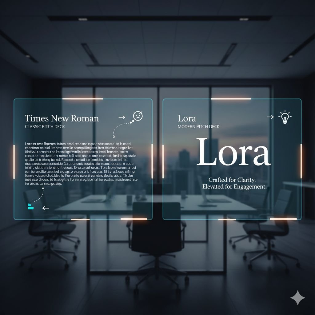
1. Lora
Lora is gentle, elegant, and balanced. It keeps the structure of a classic serif but softens the edges for screen readability. Use it for slide titles or quotes when you want a refined tone that still feels approachable.
2. Playfair Display
This font makes a statement. With high contrast and graceful letterforms, Playfair Display looks like it belongs in a magazine. It’s ideal for creative projects, pitches, or luxury presentations where you want to stand out visually.
3. Merriweather
Merriweather offers bold strokes and wider spacing, making it easy to read even from a distance. It’s perfect for body text or key points that need attention. Its slightly heavier design gives your slides a confident and professional edge.
4. Libre Baskerville
If you want the elegance of old-style typography without losing modern sharpness, Libre Baskerville is your font. It feels intellectual and trustworthy, great for educational or corporate presentations.
5. Georgia
Georgia is a classic that has aged gracefully. It was designed to look good on screens long before digital typography took off. It still offers the warmth of print fonts but displays beautifully on modern devices.
Choosing Between Classic and Modern: What’s Right for You?
Your choice depends on what you want to communicate. Times New Roman works when you need structure, formality, or tradition. It’s still perfect for academic papers or corporate reports.
But when you’re designing slides for a presentation, modern serif fonts are more effective. They feel current, approachable, and intentional. They add subtle beauty without overpowering your content.
Think of Times New Roman as a well-tailored suit — formal, predictable, timeless.
Modern serifs? They’re the same suit, just with better fabric, cleaner lines, and a perfect digital fit.
If you want to know more about the presentation design, check our guide on: The Psychology Behind Effective Presentation Design and gain knowledge.
Quick Tip for Presenters
Design and delivery go hand in hand. The right font can set the mood, but your presentation style completes the experience. If you want to level up your speaking skills, check out our guide on how to become a better presenter. You’ll find practical tips on body language, storytelling, and confidence that align beautifully with strong slide design.
Key Takeaways
- Times New Roman is reliable but no longer ideal for modern slides.
- Modern serif fonts like Lora and Playfair Display offer better readability and style.
- Good typography builds audience trust and keeps attention longer.
- Mixing serif and sans-serif fonts gives your slides visual rhythm and clarity.
- Your font choice shapes the tone of your message — make it count.
Final Thoughts
Fonts are often overlooked, but they speak before you do. They set the stage for how your audience feels about your message. Times New Roman will always be a classic — but classics can evolve.
Modern serif fonts bring that same elegance into a digital world. They’re versatile, screen-ready, and full of character. The next time you build a deck, give your slides a typeface that feels as fresh and confident as your ideas.
Because great design doesn’t just look good — it feels right.