Creating a good presentation is not just about putting text and images on slides. It is about making your message clear and easy to understand. Many people make small mistakes in presentation design that can confuse the audience. These mistakes can also make the presentation look unprofessional. This blog will help you learn about the top 5 common presentation design mistakes, how to avoid them, and how to make your slides clean, clear, and engaging.
Mistake 1: Too Much Text on One Slide
Why this is a problem:
When you fill a slide with too many words, people do not know where to look. They may stop listening to you and start reading the slide. Also, big paragraphs on a slide make the design look heavy and boring.
What to do instead:
- Use bullet points instead of long paragraphs
- Keep only the main points on the slide
- Speak more and write less on the slide
- Leave some empty space (white space) to make it look clean
📊 Stat: People remember 80% of what they see and only 20% of what they read. So visual slides work better.
✅ A simple slide helps your audience focus and understand better.
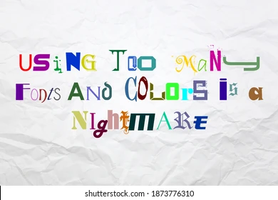
Mistake 2: Using Too Many Fonts and Colors
Why this is a problem:
Using many different fonts or too many colors makes your slide look messy. It can confuse your audience and reduce the professional look of your presentation.
What to do instead:
- Use only 1 or 2 fonts across the whole presentation
- Choose colors that match and look calm on the eyes
- Use bright colors only to highlight key points
- Keep the background and text colors in good contrast (light and dark)
✅ Simple fonts and colors make your slides easy to read and remember.
Mistake 3: Poor Image Quality or No Visuals at All
Why this is a problem:
Slides with blurry images or no images at all feel boring. Pictures help your audience understand and remember your message. But low-quality images can spoil your design.

What to do instead:
- Use clear, high-quality images related to your topic
- Avoid clipart or stretched pictures
- Add simple icons or graphics to explain ideas
- Use charts or graphs instead of tables to show data
📸 Visuals are powerful — they catch attention and improve understanding.
✅ Good visuals make your message stronger and easier to follow.
Mistake 4: No Consistent Layout
Why this is a problem:
If each slide has a different layout, your presentation may look untidy. The audience may get distracted and find it hard to follow. It shows a lack of planning.
What to do instead:
- Use the same layout style for all slides
- Keep font sizes and headings the same on every slide
- Align text and visuals properly
- Use a template or design style guide to keep it consistent
✅ A consistent layout makes your presentation look neat and professional.
Mistake 5: Ignoring the Audience’s Needs
Why this is a problem:
Some presentations are made only to look good, but they don’t answer the questions that the audience has. The main goal of any presentation is to share useful information clearly.
What to do instead:
- Understand who your audience is (students, clients, investors, etc.)
- Keep the language and tone simple and friendly
- Use examples that the audience can relate to
- Ask for feedback or questions during or after the presentation
✅ A good presentation is not just beautiful — it is also helpful and meaningful.
Comparison Table: Good Design vs. Bad Design
| Design Element | Bad Design | Good Design |
| Text | Too much text, long paragraphs | Bullet points, short sentences |
| Fonts and Colors | Too many styles and clashing colors | 1–2 fonts, calm and matching colors |
| Images | Blurry or no images | High-quality visuals and simple icons |
| Layout | Random and messy | Consistent and balanced |
| Audience Focus | Too focused on looks, less on message | Focused on both design and clarity |
Final Thoughts on Avoiding Presentation Design Mistakes
Presentation design is not about showing off. It is about making your ideas easy to understand. When your slides are clean, consistent, and simple, your audience will enjoy and remember your message.
To avoid these common mistakes, start by keeping your slides simple, visual, and focused on your audience. And if you feel stuck or need support, our presentation design service can guide you to create slides that are not only beautiful but also meaningful.
🎯 Less clutter. More clarity. That’s the secret to a strong and memorable presentation!
FAQs about Presentation Design Mistakes
1. How much text is too much for a slide?
Try to keep it under 6 bullet points and 6 words per point. Speak more, write less.
2. Can I use fancy fonts?
It is better to use simple and readable fonts like Arial, Calibri, or Roboto.
3. Should I add videos in my presentation?
You can! But keep videos short and only if they add value to your topic.
4. What if I don’t know how to design?
Use ready-made templates or work with a presentation design service for help.
5. How many slides should I use?
There is no fixed number, but keep only one idea per slide for better clarity.