Trying new design ideas in your presentations is a great way to make your slides look fresh and interesting. But sometimes, these new ideas can go wrong if we don’t use them in the right way. In this blog, we will talk about the top mistakes to avoid when using new presentation design ideas.
Why Should You Be Careful with New Design Ideas?
New design styles are fun and exciting. They can help make your slides look modern and engaging. But if you use too many changes at once or use styles that do not match your topic, your message can become unclear. Your audience may feel confused and not understand your main points.
📊 Fact: A Microsoft study says that most people lose focus after just 8 seconds if the slide is too crowded or unclear.
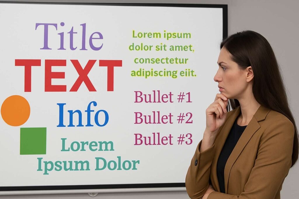
Mistake 1: Using Too Many Fonts and Colors
Why is this bad?
Trying different fonts and colors is fun, but using too many at once makes your slides look messy. It becomes hard to read and can distract the audience.
How to fix it:
- Use only one or two fonts across your presentation.
- Choose soft and professional colors. Use bright colors only for highlights.
- Keep the text color and background color in good contrast for easy reading.
✅ Tip: Choose fonts like Arial, Roboto, or Calibri for clear and neat slides.
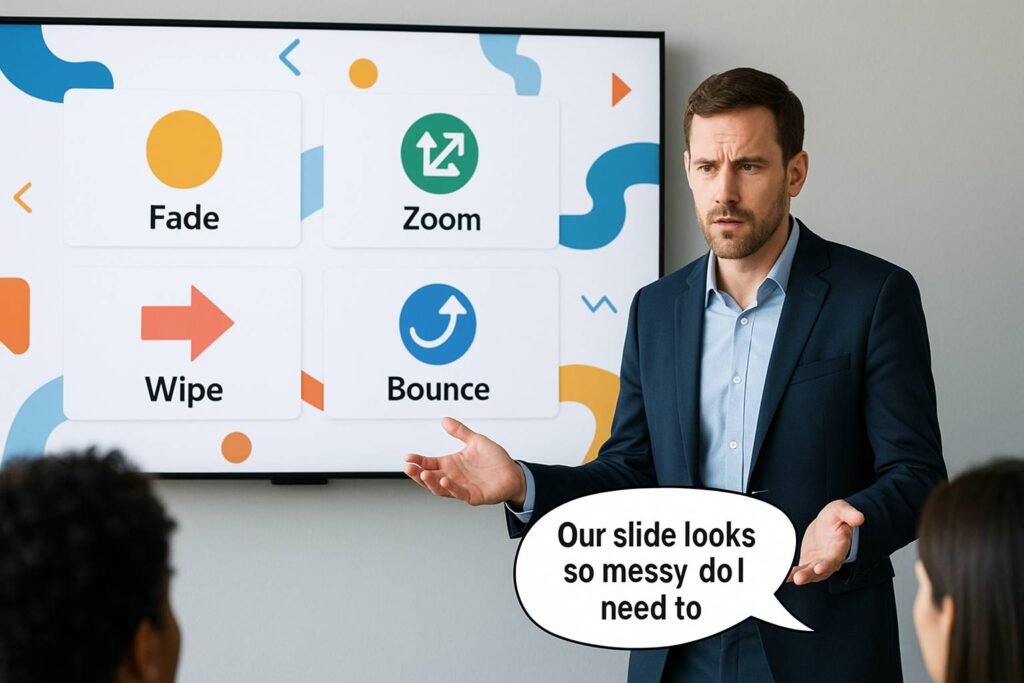
Mistake 2: Adding Too Many Animations or Transitions
Why is this bad?
Animations can make your slides fun, but using too many makes your presentation slow and distracting. Some viewers may even feel tired watching too much movement.
How to fix it:
- Use only simple transitions like “fade” or “appear.”
- Keep animation speed normal or fast. Avoid slow-moving effects.
- Use animations only when needed, like for highlighting points.
📈 Stat: According to presentation experts, using more than 2 types of animations can reduce attention by 25%.
Mistake 3: Trying Complex Layouts That Are Hard to Follow

Why is this bad?
New layout styles may look stylish, but they may not be easy to read. If text and images are placed in unusual spots, your audience might get confused.
How to fix it:
- Follow simple left-to-right and top-to-bottom layouts.
- Keep one main point per slide.
- Make sure there is enough space between text and images.
✅ Tip: A clean layout helps your audience stay focused on your message.
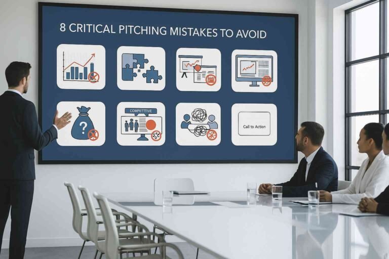
Mistake 4: Ignoring the Purpose of the Presentation
Why is this bad?
Design ideas must match your topic. For example, using fun cartoon icons in a business report presentation can look unprofessional.
How to fix it:
- Always match your design style with your topic.
- Use formal designs for business and client meetings.
- Use fun designs only for creative or casual topics.
📊 Fact: 60% of people say they trust a presentation more when the design matches the topic.
Mistake 5: Using Trendy Ideas Without Testing
Why is this bad?
Not all new ideas work for every audience. If you try a new style that your audience doesn’t understand, it may reduce the impact of your message.
How to fix it:
- Always test new ideas with a few people before using them in your final presentation.
- Ask for honest feedback.
- Choose ideas that help explain your message better, not just make the slide look fancy.
✅ Tip: Good design is not just about looking nice; it should also help the audience understand better.
Comparison Table: New Design Ideas – What Works vs. What Doesn’t
| Design Element | Wrong Use (Don’t Do) | Right Use (Do This) |
| Fonts & Colors | Too many fonts and clashing colors | 1–2 fonts, matching soft colors |
| Animations | Many slow or fancy animations | Only 1–2 simple animations |
| Layout | Confusing placements, too much on one slide | Simple layout, one point per slide |
| Design Style | Style doesn’t match topic | Design matches subject and audience |
| Trendy Designs | Used without testing | Tested with feedback before final use |
Mistake 6: Not Checking for Readability
Why is this bad?
Sometimes, people use light colors, small fonts, or background images that make the text hard to read. If the audience cannot read your content, your whole message is lost.
How to fix it:
- Use a good contrast between background and text.
- Make sure font size is big enough (at least 24pt for body text).
- Avoid writing long paragraphs. Use bullet points instead.
📊 Stat: 85% of people stop reading slides if they cannot read the text clearly in the first few seconds.
Mistake 7: Overcrowding the Slides
Why is this bad?
When you put too much information on one slide, the audience may feel tired or lost. They won’t know where to look.
How to fix it:
- Share only one idea or message per slide.
- Use white space (empty space) to keep slides clean.
- Break long content into 2–3 slides.
✅ Tip: A simple slide with clear focus always works better than a busy one.
Final Thoughts
Using new presentation design ideas is a great way to make your slides look interesting. But it is important to use them the right way. Keep it simple, clear, and easy to read. Always match the design with your topic, test new ideas, and focus on helping your audience understand your message.
If you want to avoid all these mistakes and create professional slides, you can also work with a presentation design service. They know what works best and can make your ideas come alive in a simple and effective way.
With the right design, your presentation can leave a strong impression! 🚀
FAQs
1. Can I use animation in every slide?
No. Use animation only when needed. Too many can be distracting.
2. What is the best font size for presentations?
Use at least 24pt for body text and 32pt or more for titles.
3. Can I use bright colors in business presentations?
Yes, but only for highlights. Use soft or neutral colors as your main theme.
4. Should I try new design ideas in every presentation?
Try one or two new ideas at a time. Always test them with a small group first.
5. Why is matching design with a topic important?
When the design matches the subject, the audience understands and trusts your message more.