Introduction
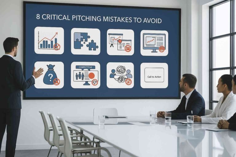
We all know the experience—sitting in a conference room or attending an online webinar, slowly drifting off as the presenter drones on and on, wrestling with the slides, or reading verbatim. A bad presentation bores an audience, undermines credibility, weakens communication, and often leaves them more confused than when they began.
But why are these presentation disasters happening again and again? More importantly, what can we learn from them? Whether it’s a poorly designed slide deck, a monotone speaker, or a catastrophic technological failure, every terrible presentation tells us something. We can learn exactly what NOT to do from the worst presentations ever, ensuring that we’re delivering engaging, memorable, and persuasive presentations.
Learning from the Worst to Become the Best
People remember bad presentations better than they remember good ones. Not for good reasons, however. When you fumble your way through a speech, read word-for-word from your slides, or create data overload upon the audience, it sticks, but not exactly in a helpful way to the speaker. So, are you committing common presentation mistakes? Many presenters, without realizing it, make the same mistakes that weaken their message. The key to self-improvement lies in learning from and avoiding these mistakes.
The Overloaded Slide Nightmare: Too Much Text, Too Little Impact
Text overuse is among the most frequently occurring mistakes made while designing slides. A presentation PowerPoint deck needs to support and accompany the presenter. Unfortunately, too many people who present opt for writing big paragraphs on slides.
When the audience is forced to read a dense wall of text while their brain is also trying to listen to the speaker, it becomes cognitively overloaded, and they remember nothing. Good presentations are concise bullet points and high-impact visuals, with the speaker developing key points as opposed to reading off the screen.
Example: The NASA Challenger Disaster Presentation
In one of the most infamous failures to present effectively, engineers at NASA in 1986 gave evidence that would make the Challenger space shuttle potentially collapse due to malfunctioning O-rings. They did this instead of highlighting the issues, cluttering the slides with many intricate charts, complicated data-heavy tables, and even heavy text. It led to the tragic failure, which would otherwise have been preventable, for decision-makers failed to comprehend the gravity of the situation.
Lesson: Always prioritize clarity in your slides. Less is more—remove unnecessary words and focus on what matters most.
Death by Bullet Points: When Lists Kill Engagement
While bullet points are helpful in some ways, too much use of them tends to suck life out of the presentation. An endless list of bullet points on every slide would lead to disengagement and boredom in the audience. Presenters who rely purely on lists of items fail to connect with the audience emotionally; therefore, the message is likely to be easily forgotten.
Example: A Corporate Pitch Gone Wrong
A Fortune 500 company once presented a sales presentation that contained more than 300 bullet points on 50 slides. Though the product was great, no sales were generated because the audience got lost in the sheer volume of text.
Lesson: Instead of cramming bullet points, use visuals, storytelling, and compelling data points to keep your audience engaged.
Technical Failures: When Slides Won’t Load and Mics Go Silent
Technology is an awesome tool until it breaks. Sometimes, it does not function, and a broken microphone or failed projector can stop your presentation altogether. The bad thing is that many of these preventable mistakes simply require basic preparation.
Example: Bill Gates’ Infamous Blue Screen of Death

Image credits: Microsoft’s Grave Blunder
In 1998, Microsoft’s co-founder, Bill Gates, was demonstrating Windows 98 when it crashed on the stage and appeared with the awful “blue screen of death.”. The audience in the room went into hysterical laughter, and at that moment, it became probably one of the most embarrassing demonstration failures in technological history.
Lesson: Always have a backup plan. Print key slides, test your equipment beforehand, and be prepared to improvise if something goes wrong.
Monotone Madness: The Presenters Who Put Everyone to Sleep
Even the most interesting topic becomes unbearable if a presenter speaks with a lifeless voice, without enthusiasm, and does not engage the audience. Great presenters know that voice modulation, body language, and enthusiasm are very important to keep an audience’s attention.
Example: The Worst TED Talk Ever?
A TED Talk about a scientific discovery was so delivered that the attendees started checking their phones and getting up and leaving. It would have been gold had the presenter been less monotonous and engagingly communicative of his material.
Lesson: Energy matters. Change your tone, use gestures, and engage with your audience to keep them invested in your message.
The Data Dump Disaster: When Numbers Overwhelm the Message
Numbers and statistics can lend credibility, but too many of them can drown an audience. Inconspicuous slides cluttered with charts, tables, and figures without context only confuse the audience.
When it comes to visual appeal, the biggest mistakes people make when designing presentations often involve excessive text, poor color choices, and cluttered layouts. A well-designed presentation should enhance, not distract from, the speaker’s message. Slides should be clean, engaging, and structured in a way that complements the flow of information.
Example: A Startup Pitch That Went Nowhere
A tech start-up presented to investors, flooding the 20 slides with their financial projections, cost breakdowns, and revenue forecasts, and soon after, investors just lost interest: they just did not have enough vision behind this sea of endless numbers.
Lesson: Present only the most critical data and provide context. Use visual aids like infographics and simple charts instead of overwhelming spreadsheets.
Cringe-Worthy Corporate Jargon: When Buzzwords Ruin Clarity
Most presenters believe that the more “corporate speak” or jargon they employ in their presentation, the more professional they will sound. Such is not always the case. Overly complex language drives away listeners and complicates the message.
Example: The Infamous “Synergistic Paradigm Shift” Speech
A CEO gets up to a podium and, in a keynote talk, is peppering the audience with buzzwords: “leveraging scalable solutions, paradigm shifts.”. The listener leaves without actually knowing what all that means.
Lack of Preparation: When Presenters Wing It and Fail
If rehearsed inadequately or not at all, even a good presentation design can become a disaster. Speakers unprepared or without rehearsal will be unable to stay on their message, muddle over their words, and be unprofessional.
Example: Elon Musk’s Tesla Cybertruck Reveal

During the presentation of Tesla’s Cybertruck, Elon Musk boasted that its windows were “shatterproof.” Later, in a test demonstration, the glass cracked. The gaffe was immediately viral.
Lesson: Always rehearse, and if something unexpected happens, recover gracefully.
Lessons from the Worst: How to Avoid These Common Mistakes
Every bad presentation teaches us something. The key takeaways are:
- Keep slides clear and concise.
- Avoid overloading presentations with bullet points and jargon.
- Test all technology beforehand and have a backup plan.
- Use voice modulation and storytelling to engage the audience.
- Rehearse thoroughly to ensure a confident, polished delivery.
Conclusion
Bad presentations are very valuable in teaching what should be avoided. Learning from common mistakes makes the presenter avoid the same blunder and ensures the audience remains interested in the presentation. The quality of a presentation can indeed shift from being a potential disaster to a to-be-remembered presentation with excellent preparation, clear messaging, and an energetic delivery.
FAQs
1. What is the biggest mistake in a presentation?
Overload slides with text and read them verbatim.
2. How can I prevent technical issues during a presentation?
Test all equipment beforehand and have a backup plan.
3. What should I do if I forget part of my presentation?
Stay calm, rely on a structured outline, and improvise naturally.
4. How do I make my presentation more engaging?
Use storytelling, visuals, and interactive elements.
5. Why is practicing before a presentation important?
It boosts confidence, improves timing, and ensures a smooth delivery.


