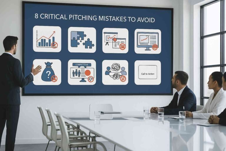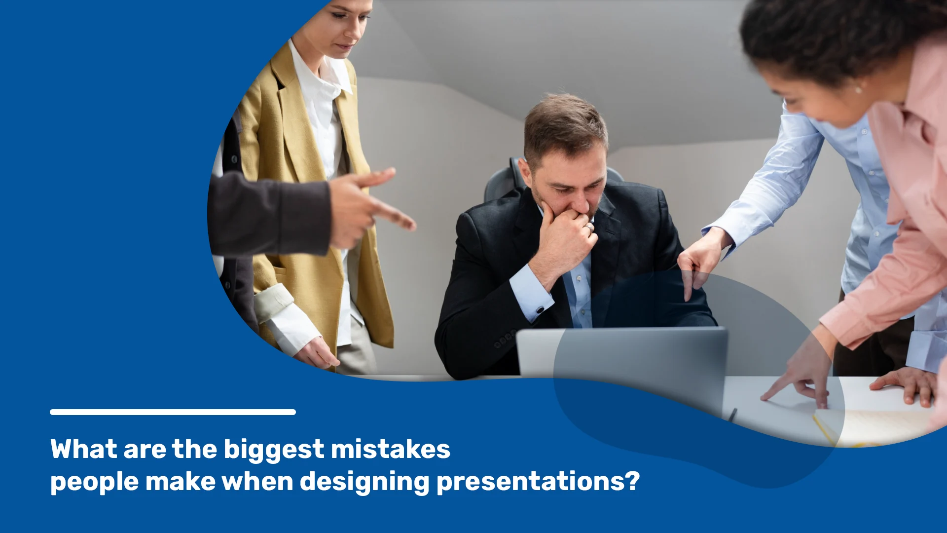
Presentations are a great way to share ideas, and knowledge, and convince people about something. Making a good presentation is like making art – it needs planning and knowing what mistakes to avoid. Even if your ideas are great, your presentation can still flop if you make common mistakes. You’ve probably seen some of these mistakes before, like too many bullet points, the stock photos that scream “clip art,” or fonts that look awful. So, how do you avoid these pitfalls and create a presentation that shines? Here’s a guide to the most common mistakes people make when designing presentations, and how Deckez, our presentation design agency, can help you avoid these mistakes and make awesome presentations.
Mistake #1: Information Overload
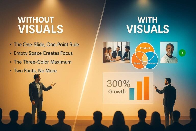
A slide packed with text blocks, charts, and images can give anyone information overload. Remember, your slides are there to support your talk, not replace it. Keep your points concise, use visuals strategically, and let your words paint the picture. Avoid using overly technical language as it can confuse your audience. Stick to simple terms that everyone can grasp. Focus on one main idea per slide to keep your audience’s attention on what’s most important.
Mistake #2: The Wall of Text
Sentences that stretch across the entire slide are a recipe for glazed-over eyes. Break up your text into digestible chunks, use bullet points sparingly, and opt for strong verbs and active voice. Don’t be afraid of empty space on your slides. It can make your content more readable. Make sure your text stands out against the background for easy reading.
Mistake #3: Stock Photo City
Generic stock photos can feel impersonal and uninspired. Instead, consider using data visualizations, custom illustrations, or even high-quality photographs that directly relate to your content. Use photos of your team or your product to create a more authentic connection. Choose images that are directly related to your message to reinforce your points.
Mistake #4: Rainbow Colors
A rainbow of clashing colors might seem eye-catching, but it can be distracting and unprofessional. Stick to a limited color palette that complements your brand or the topic at hand. Use the same color themes throughout your presentation to maintain a cohesive look. Choose colors that evoke the right emotions and reactions from your audience.
Mistake #5: Font Mistakes
There’s a time and place for fancy fonts, and a business presentation usually isn’t it. Choose clear, easy-to-read fonts that are consistent throughout your slides. Ensure your font size is large enough to be easily read from the back of the room. Stick to a maximum of two font types to keep your presentation looking clean and organized.
Mistake #6: Animation Blunders
While a few well-placed animations can add a touch of dynamism, going overboard can be overwhelming and detract from your message. Keep it simple and use animations sparingly, if at all. Only use animations that serve a purpose and enhance the understanding of your content. Animations may look different across devices. Test to ensure consistency.
Deckez’s Approach to Presentation Design
At Deckez, we believe in the power of simplicity and clarity. Our presentation development services are tailored to highlight your message, not overshadow it. We offer a slide design service that ensures each slide is a visual treat, supporting your narrative without stealing the show. Our slide service is more than just aesthetics; it’s about creating a seamless flow that guides your audience through your story. And for those seeking comprehensive support, our professional presentation services cover everything, ensuring your presentation is polished and professional. With us, you’re not just getting a service; you’re gaining an ally in the quest to deliver presentations that inspire action and drive results.
Conclusion
Designing a presentation is no small feat, but avoiding these common pitfalls can set you on the path to success. A great presentation is a blend of simplicity, storytelling, and audience engagement. With Deckez’s expertise, your next presentation can be an unforgettable experience that leaves your audience inspired and ready to act. Let’s make your message heard, loud and clear.