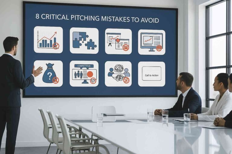
Table of Contents
- Why Your Presentation Design Matters (More Than You Think!)
- Pitfall 1: Too Much Information on Your Slides
- Pitfall 2: Bad Looking Design Choices
- Pitfall 3: Boring Your Audience
- Pitfall 4: Tech Problems During Your Talk
- Pitfall 5: Not Ready for Online Talks
- Pitfall 6: Relying Too Much on AI (Without Your Touch)
- How to Dodge DIY Dangers: Your Quick Checklist
- How Professional Presentation Design Services Help
- Final Thoughts
- Common Questions (FAQs)
Are you planning to create a presentation all by yourself? That’s great! But before you start, know this: there are many easy traps you might fall into. Making a presentation is more than just putting pictures and words on slides. It’s an art that needs good ideas, technical know-how, and practice.
As a presentation design agency, we’ve seen many people get stuck in these DIY presentation traps. So, we want to share the most common mistakes in DIY presentation design and how to easily avoid them.
The most common pitfalls in DIY presentation design are overcrowding slides, poor color choices, lack of consistency, ignoring the audience, bad quality images, not being ready for online talks, and relying too much on AI. But don’t worry, with simple steps, you can avoid these problems and create a great presentation.
1. Why Your Presentation Design Matters (More Than You Think!)
Did you know that audiences spend more time looking at your slides than listening to you? Yes, your presentation design is a quiet partner that plays a big part in how well your message is understood. Good slide design makes your talk clear and easy to follow. It helps your message stick. Bad design can make people lose trust or get bored. So, learning simple presentation tips is a big win! Explore Top 5 Mistakes to Avoid in Presentation Design.
📈 Quick Fact: Studies show that a well-designed presentation can make your audience trust you more and remember your message better!
2. Pitfall 1: Too Much Information on Your Slides
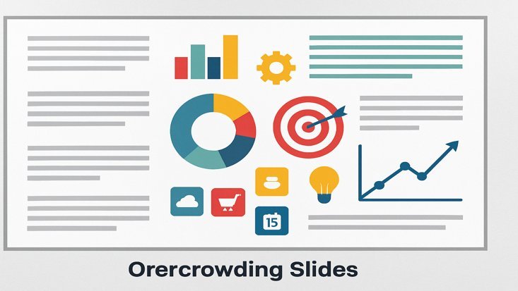
Imagine walking into a room where every wall is covered with tiny words instead of clear signs. That’s how it feels when a slide has too many words.
Remember, your slides are helpers for your talk, not a book. The goal is to show only the main ideas. Use strong pictures and short, clear words to support what you say.
How to Avoid: Use Less, Show More
- Less is Best: Try to put only 3 to 5 main ideas on each slide. Your audience will thank you for making it easy to read.
- Simple Words: Use strong, short words. Instead of “Sales increased by 20%,” try “Sales jumped up 20%!” It sounds better and is easier to grasp.
- Pictures Help: Use good, clear pictures, simple charts (infographics), or icons. They make text easy to understand. A good picture or chart can explain a thousand words without cluttering your slides.
3. Pitfall 2: Bad Looking Design Choices
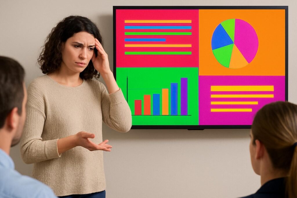
Clashing colors, old-fashioned fonts, or blurry pictures – these design mistakes can make your presentation look messy. This can make people think your business is not serious. Looking good and being clear is key in presentation design.
How to Avoid: Keep it Clean and Clear
- Pick a Theme: Use simple, modern themes from your presentation tools (like PowerPoint, Google Slides, or Canva). Choose colors that match your brand. Think simple and clean for a business talk, or bright for a fun one.
- Just 2-3 Fonts: Stick to two or three easy-to-read fonts. One for big titles, one for main text, and maybe one for special words. Keep it the same on every slide for consistency.
- Good Pictures Only: Use clear, high-quality pictures that are related to your content. Blurry or low-quality photos look unprofessional.
- Make it Easy for Everyone (Accessibility): Use colors that stand out well (like dark text on a light background). Make sure text is big enough. This helps everyone, even those with poor eyesight, easily read your slides.
4. Pitfall 3: Boring Your Audience

Imagine your audience looking sleepy, thinking about their shopping list. Yikes! Your presentation should keep them awake and interested. Add your own style, tell stories, and use humor (if it fits).
How to Avoid: Tell a Story & Get Them Involved
- Story Power: Make your presentation like a story. Have a clear start, middle, and end. Pull your audience in with a good beginning, guide them through your ideas, and leave them with something important to remember.
- Talk With Them: Ask questions, run quick polls, or have a short Q&A part. This keeps your audience alert and helps you know if they understand. For online talks, use the chat box or poll tools in Zoom/Teams.
- Use Pauses: Don’t rush! Let your main points sink in. Explain important details. Give time for questions. This makes your talk feel natural and thoughtful.
5. Pitfall 4: Tech Problems During Your Talk

Technology is a great helper, but it can also cause trouble. Avoid these tech surprises during your presentation:
How to Avoid: Plan Your Tech & Practice
- Smart Animations: Don’t use too many flashy movements. Use animations only to show important points, not to make a show. Too many flashy moves can distract from your message.
- Font Issues: Some fonts might not show up right on different computers. Stick to common fonts. Or use presentation programs that make sure your fonts look the same everywhere.
- Practice with the Tech: Always test your presentation on the computer and screen you will use before your real talk. This helps stop bad tech surprises.
6. Pitfall 5: Not Ready for Online Talks

Many presentations happen online now. What looks good in a room might not look good on a small computer screen. This is a common DIY presentation mistake.
How to Avoid: Design for the Screen
- Simple Slides for Online: Keep your slides even simpler for online talks. Less text, bigger visuals. People are often viewing on smaller screens.
- Good Lighting & Sound: Make sure your face is well lit and your voice is clear for online viewers. This is part of your presentation’s overall look.
- Clean Background: Use a simple, tidy background or a branded virtual background. Avoid messy rooms behind you.
- Look at the Camera: Make eye contact with your camera, not just your screen. This helps you connect better with your online audience.
7. Pitfall 6: Relying Too Much on AI (Without Your Touch)

AI tools are amazing helpers, but they can also be a pitfall if you let them do all the work. Just taking AI’s output without adding your own touch can make your presentation feel cold and generic.
How to Avoid: Make AI Your Assistant, Not the Boss
- AI as a Start: Use AI tools (like ChatGPT or Tome) to get ideas, outlines, or first drafts. They are great for speed.
- Add Your Story & Emotion: Always rewrite the AI-generated content in your own words. Add your personal experiences, your passion, and the unique story of your business. This is what investors connect with.
- Fact-Check AI’s Work: AI can sometimes make mistakes or give old information. Always check all facts, numbers, and sources AI provides.
8. How to Dodge DIY Dangers: Your Quick Checklist
Here’s a simple checklist to help you avoid common DIY presentation design pitfalls:
- Embrace Simplicity: Limit text (3-5 points per slide), use big fonts, and keep visuals clean.
- Be Consistent: Stick to 2-3 fonts and a small color palette that matches your brand. Use a single template throughout.
- Think Audience First: Design for them. What do they need to see and hear?
- Check Quality: Only use high-quality, clear images. Test animations to ensure they are smooth, not distracting.
- Practice Delivery: A great presentation isn’t just about the slides; it’s about how you talk. Practice until you feel confident.
- Use AI Smartly: Let AI help with basic tasks, but always add your unique human story and check its work.
- Prepare for Online: If presenting online, simplify slides, check your lighting, sound, and background.
9. How Professional Presentation Design Services Help
Creating a successful presentation can take a lot of time, especially if design is not your main job. This is where professional presentation design service come in. We are experts at making good-looking and clear presentations that will grab your audience’s eye and make them remember your message.
Here are ways to helps you:
- Clear Ideas & Storytelling: We help you make your message simple, build your talk for strong impact, and add story parts to keep people interested.
- Expert Design: Our skilled dedicated designers create pro-looking slides with stunning pictures, charts, and data visuals.
- Brand Looks Right: We make sure your presentation matches your brand using your colors, fonts, and logo.
- Save Your Time: When we design your presentation, you get more time to focus on your main work.
10. Final Thoughts
Making a great presentation doesn’t have to be a battle. By avoiding these common DIY presentation design pitfalls and using these simple hacks, you can make your next presentation amazing. It will leave your audience wanting more!
Want your slides to truly stand out and avoid all these traps? Contact today for expert presentation design services! We make sure your slides are clean, eye-catching, and easy to understand. This simple step can help you win big with your audience. 🚀
Common Questions (FAQs)
1. What is the biggest mistake people make in presentation design?
The most common mistake is putting too much information or too many words on slides, making them cluttered and hard to read.
2. How many colors should I use in my presentation?
It’s best to stick to a limited color palette, usually 2-3 main colors that complement each other and your brand, to keep your presentation looking clean and professional.
3. Should I use different fonts on every slide?
No, for consistency and professionalism, use only 2-3 consistent fonts throughout your entire presentation – one for titles, one for body text, and maybe one for accents.
4. How can I make my presentation more engaging?
Tell a story with your content, use strong visuals, and include interactive elements like questions or polls to keep your audience involved.
5. Can AI tools help me avoid design pitfalls?
AI tools can help with initial drafts, design suggestions, and content ideas, but you still need to add your human touch, fact-check, and ensure the presentation truly reflects your unique message and brand.